Track By Track: Washed Out – Mister Mellow
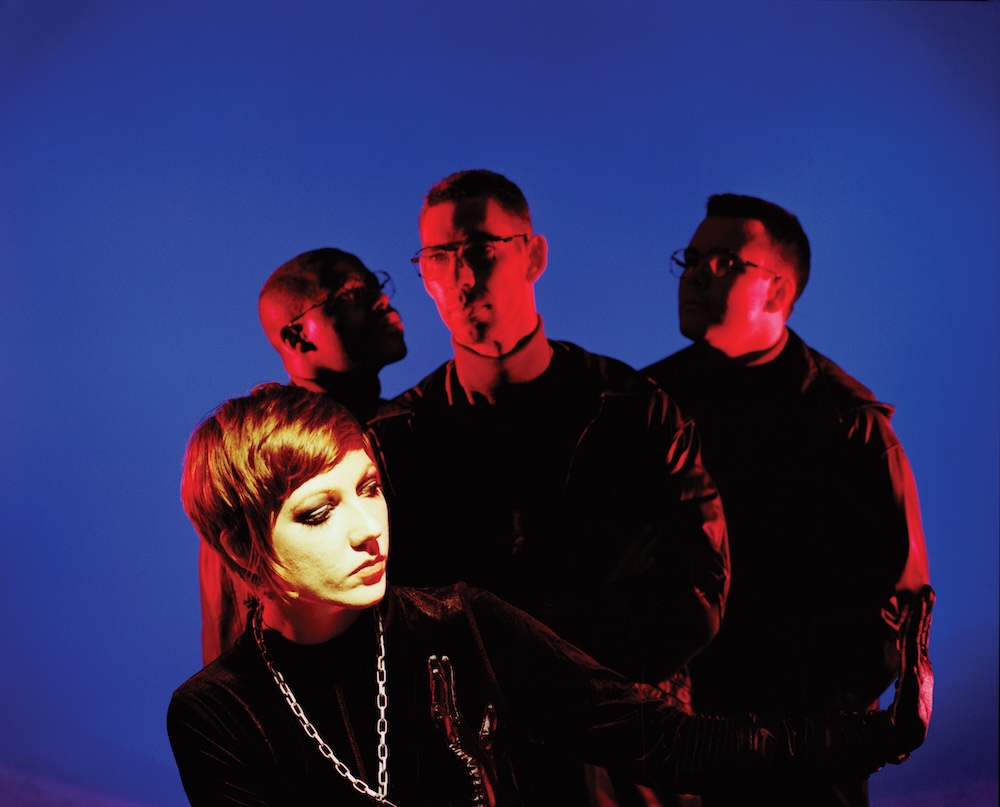
Ernest Greene rose to prominence during the late noughties, his sound somewhat drawing upon the melancholic declination of indie and the new age era of synth pop. His sound has always fallen somewhere in between expectations, not one to conform to the limitations of genre yet receiving critical acclaim from a relatively mainstream audience. His sound has aged with time and this is perhaps best highlighted through the release of his new album on Stones Throw records. A feature on a label of such prominence is no small feat and is the reward for a career well spent.
We caught up with Ernest Greene, aka Washed Out, to talk through his new album…
"This entire album reminds me of the summer – so every song has that same feeling. The album has a lot to do with feeling frustrated or burnout – and I think the heat of the summer can often intensify that feeling. Everything is that much harder to do in the heat – so its that much more frustrating. I think of a movie like Spike Lee’s “Do the Right Thing” – a really stifling hot NYC day.
All of the song were written in my basement studio in Athens, Georgia. I think the album is best experienced by watching the full visual album with a good sound system – perhaps with a mind altering substance (if you’re into that sort of thing)."
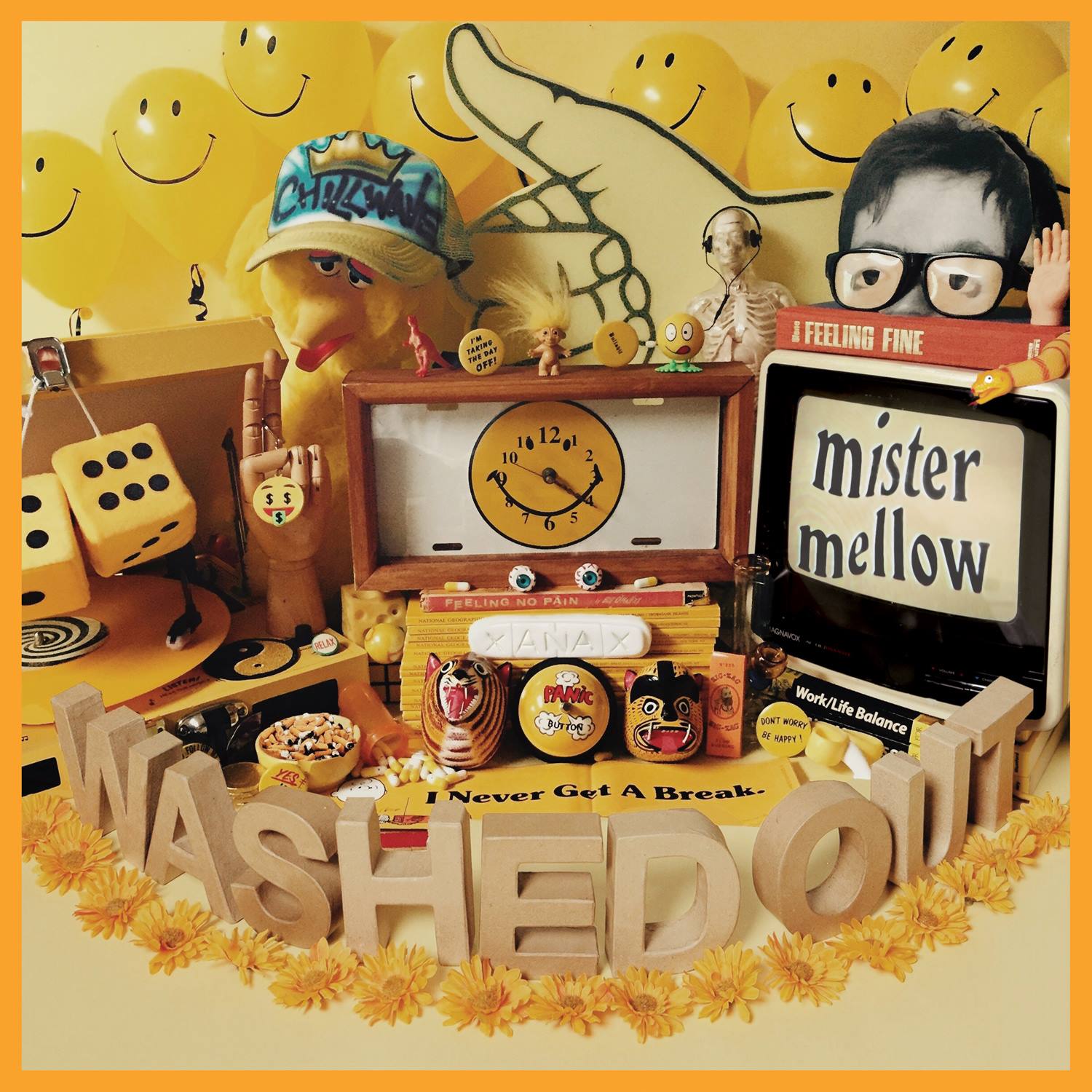
Title Card
Colour: Yellow
Yellow is the major color that ties together the artwork for the album. It makes sense that this intro track invokes that color. For me, yellow represents this weird balance between being dazed and focussed.
Inspiration: The major feeling I wanted to communicate with this album was a sense of dazed wooziness to everything. I wanted this song to be a short introduction to that vibe.
Burn Out Blues
Colour: Blue
This song is about experiencing burnout by doing the same thing every day. Obviously, the colour that comes to mind is blue – as one is feeling down and has the “blues”.
Inspiration: This song is about the feeling of sensory overload. So I liked the idea of having a lot of busy layers made up of strange weird sounds.
Time Off
Colour: Orange
This song feels orange to me. The character talking during the voiceover seems a little bit dazed and confused and orange sums up that feeling for me.
Inspiration: This short interlude continues to evoke a playful wooziness. The character is slightly blunted and not quite thinking clearly.
Floating By
Colour: Blue
Another song about feeling down in the dumps, so blue, again, feels like the most appropriate color.
Inspiration: Brazilian music was a big influence on this song. The percussion is taken directly from a Tropicalia style beat.
I’ve Been Daydreaming My Entire Life
Colour: Mutli-colour rainbow.
This song is about daydreaming and evokes a lot of different colors cycling through in a very psychedelic way.
Inspiration: This song is intentionally laid-back so that it mirrors the sensation of daydreaming.
Hard To Say Goodbye
Colour: Blue
A song about lost love – so blue again feels appropriate.
Inspiration: The inspiration for this song was 90’s hiphop that incorporated a lot of jazz samples. To me, that represents a certain type of urban sensibility. It makes me think of riding metro trains through a hot summer day.
Down and Out
Colour: Black
This song is slightly depressing – about the character not really wanting to go to work. Black feels right as it describes the feeling of bleakness.
Inspiration: The inspiration for the music was to mimic the sensation of claustrophobia – like the room is moving in towards you.

Instant Calm
Colour: Green
This song is about how music can kind of lift you up – and give you the sensation of floating. Green comes to mind as it reminds of a certain plant that can help a listener become “Instantly Calm”…
Inspiration: I thought of this song almost like a “chopped and screwed” song – like its moving a bit in slow-motion.
Zonked
Colour: Red
This song is about being overworked and stressed-out so red feels most appropriate – like your head’s about to explode.
Inspiration: I think certain types of high-tempo dance music can represent the feeling of being overwhelmed. That was the ultimate goal with this song – to have so many crazy layers popping out of the mix that it sort of overwhelms you as the listener.
Get Lost
Colour: Black
This song always reminds me of a dark club with only bits of dynamic strobes and ambient light. So black feels right to represent that darkness.
Inspiration: Late night club experiences were the inspiration for this song – where it's easy to close your eyes, dance and get lost in the music (and inside your own head).
Easy Does It
Colour: White
Again, the sensation of floating in the air comes to mind. Maybe whisking through the clouds – so white makes perfect sense.
Inspiration: Again, I wanted to mimic the feeling of a dream (waking or sleeping). Like you’re slowly floating around the room.
Million Miles Away
Colour: White
Almost a continuation of the same floating sensation from the previous song. Again, I picture floating through the clouds – particularly the final droning section of the song.
Inspiration: After a lot of songs that mimic the sensation of sensory overload. This song is intentionally laid-back and chill. It's meant to signal an acceptance or understanding – and through that acceptance finds peace.
Buy the release from the 30th HERE.