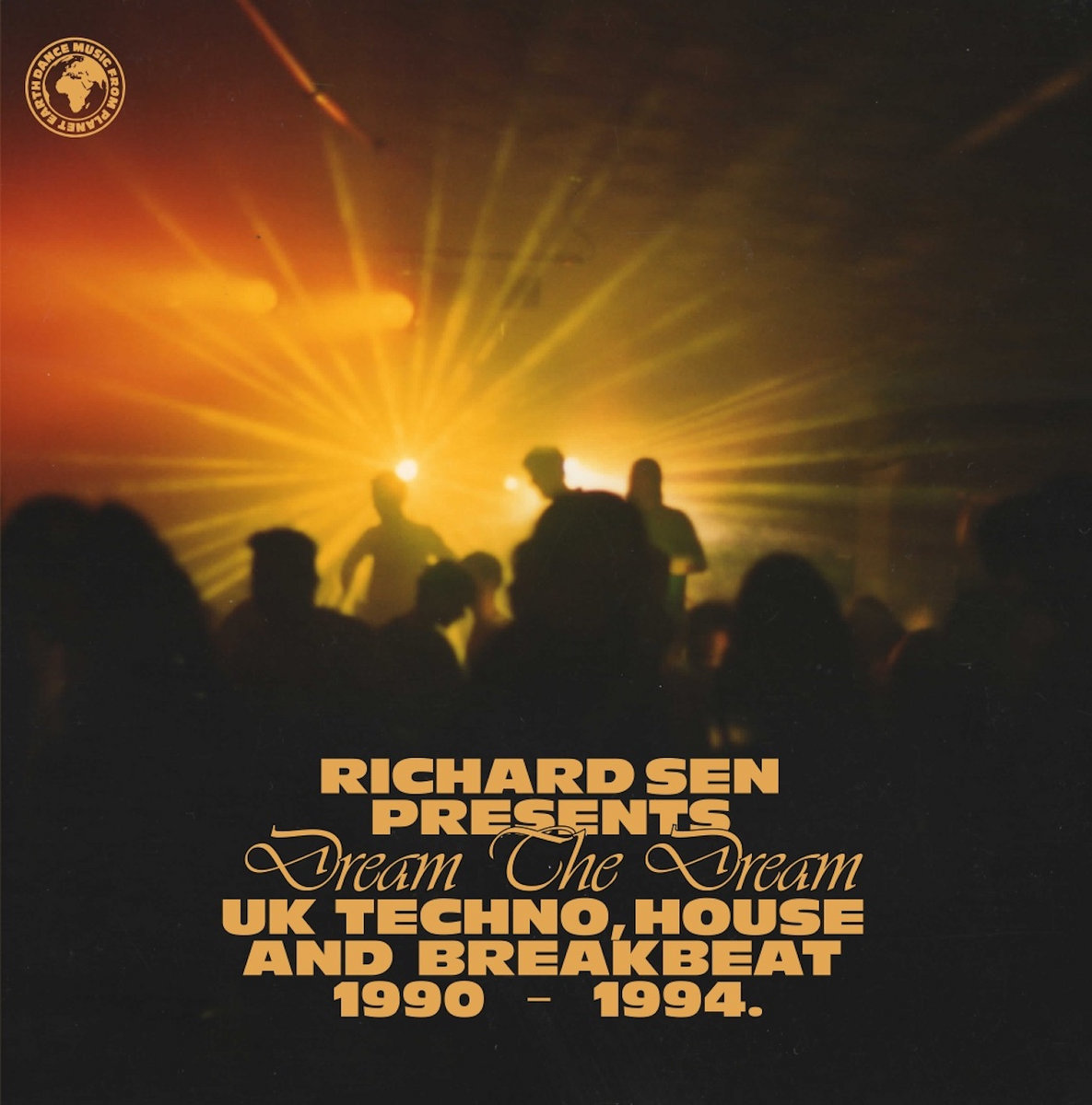
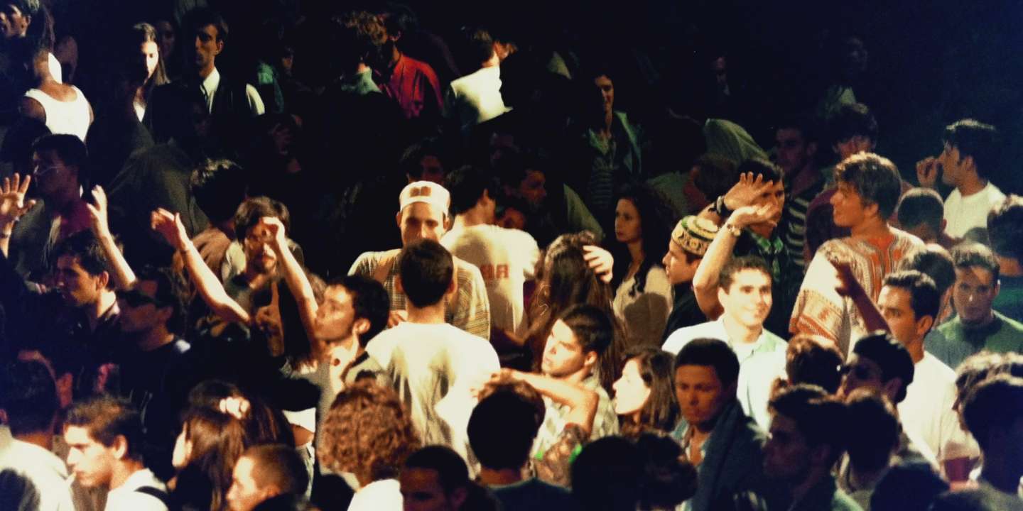
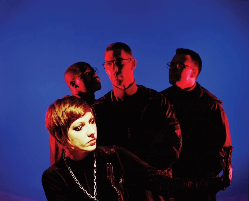
You Can Find Me In The Club: Commune
comm•une are a mongrel bunch… in the most flattering sense of the world. Formed of members of Throwing Snow and Dark Sky, the people behind The Daily Street, Hyponik and more they've been throwing parties down the Dance Tunnel for a little over a year now.
We missed their birthday last month… but we still thought it time we had a little chat to em about them and what shapes the visual aesthetic of the night.
Tell us about comm•une
At the core of it, comm•une is a club night that takes place each month at Dance Tunnel in East London where we play music we like and book our favourite djs/artists. We've been doing our thing, looking to promote our nights in a meaningful/creative way, keeping the promotional noise right down and gradually building a community of interesting creative people from the ground up.
It feels like this thing is developing all the time and we now have plans to travel around with comm•une, put on interesting events further afield, work on cool creative projects and continue to have fun down at Dance Tunnel.

What was the idea behind the branding and visual identity of the night?
Our good friend Chris Benfield is the man responsible for all our design. Although elements such as quality bookings, sound and environment are integral to creating a great club night, we all believe music, design and art are interests that go hand in hand. As for the visual identity, it's most people’s first experience of the night, well before they've stepped into one of our parties, so it's important that it tells the right message from the get go.
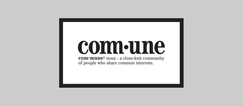
One of our members is an Art Director so we approached this quite methodically from the start. Once we realised what we wanted to achieve with the night – what it was going to be about – we found a name. It took quite a bit of digging, but we came to comm•une and it just made sense, especially the dictionary definition "a close-knit community of people who share common interests". That hit it on the head for us really. With such a strong focus on this we thought it could be cool to take our design direction from the dictionary itself rather than the music we would be pushing, hence the more traditional typeface and the dot in the middle. Our designer Chris brought the whole idea to life when he created the logo, using that type and combining the double ‘mm’ before the dot. It's all good having a strong branding idea, but it takes a talented designer like Chris to turn that into an identity.
At this point I think it's important to state that your brand can have a beautiful logo but if the culture isn’t there to support it, then the design itself means nothing. With the logo it was important to capture the essence of comm•une, what it does and how it brings people together through music and community. The line-ups, the music and vibe of a night are integral and it's those elements that gives the logo and visual identity any kind of meaning.

Tell us about the series of postcards from last year?
For a run of 9 months we decided to produce postal invites that we could send out to our combined friends and family. This started with 3 traditional card invites, followed by a series of 5 postcards and capped off with a Christmas card in December last year. It was an attempt to bring back a personal feel to promotion, to get people's attention in a world where Facebook event marketing has rightfully turned people's interest off. I think promotion has become a bit of a dirty word, but we wanted to show that it can actually be enjoyable to be promoted to if it's done respectfully and with some care and a level of creativity. We wanted our promotion to feel collectable.
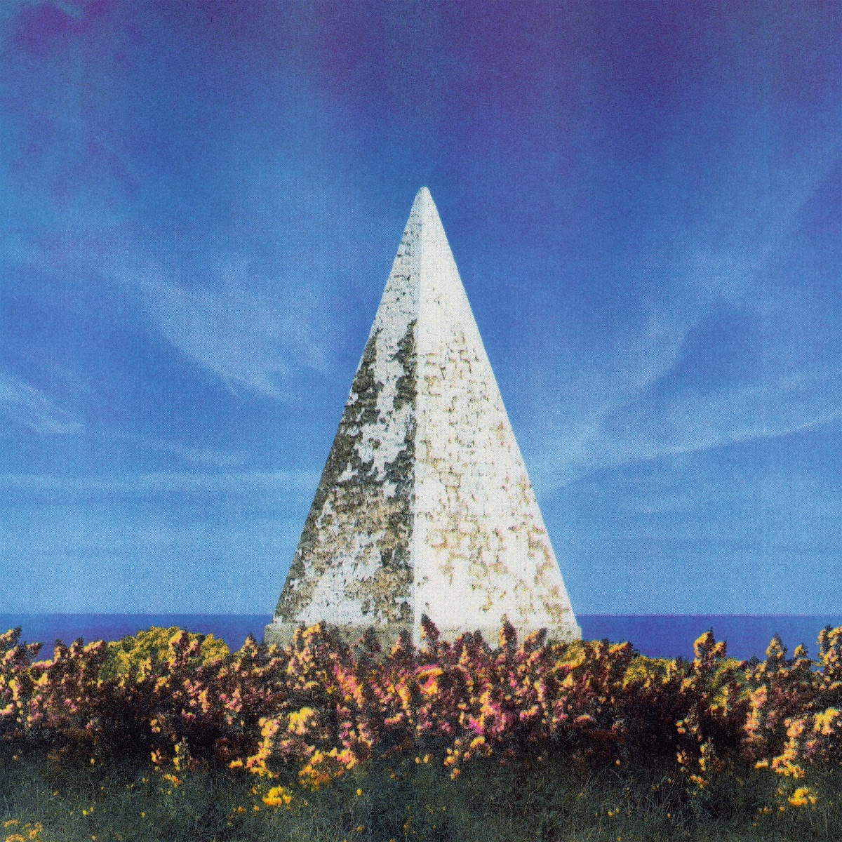
For the series of picture postcards we looked further into the history of military communes and collected some really amazing photographs in the process. The aim was to start with an image of a small commune and have the number of members progress and location change on each. We drew influence and used imagery from the Parisian Commune of 1871, imperial Russia, the collective community in Israel called Kibbutz, the various Kommunes from Germany and beyond. There's something so striking about the feeling of togetherness and power in these images.


You've recently stopped the postcard series and moved back to other methods. How come?
We don't ever want our promotional outlets to become repetitive. That's really important. It's only a matter of time before a unique style of promotion goes from captivating to irritating, so we wanted to make sure we stopped the postcards before we got anywhere near that happening. I'm sure that they'll return for a special occasion.
Posters give us a different opportunity to be creative and a different challenge. They're also a lot larger (obviously), which gives us more room to be creative. We've approached them in a similar way to our postcards, trying to make them desirable objects. We look at every design and say "would you want to frame that and put it up in your house?". That's our litmus test. Again we're working in sets of 3 and for the first set we gave our designer Chris complete creative control. He took the "piece of art" vibe literally and came back with 3 poster designs based around painting and art, each as striking as the other.

Plans for the future?
As far as events go, we’re back at Dance Tunnel next week (Thursday 10th July) with a residents special, that ones free entry. We’ll be hosting a party with The Love Below crew at Ace Hotel Basement on Friday 18th July, whilst simultaneously DJing over at Soundwave Festival in Croatia.
We're currently working on a project that will showcase photography, design, poetry, writing and illustration as well. There'll be more info on that very soon.
A big thanks goes to everyone at Dance Tunnel, our designer Chris Benfield and all the people who played records for us and danced with us over the past 12 months.
For all the upcoming happenings check >> http://mmune.co/
And listen to their first mixtape they did for their birthday last month….


Must Reads
David Holmes – Humanity As An Act Of Resistance in three chapters
As a nation, the Irish have always had a profound relationship with the people of Palestine
Rotterdam – A City which Bounces Back
The Dutch city is in a state of constant revival
Going Remote.
Home swapping as a lifestyle choice
Trending track
Vels d’Èter
Glass Isle
Shop NowDreaming
Timothy Clerkin
Shop Now