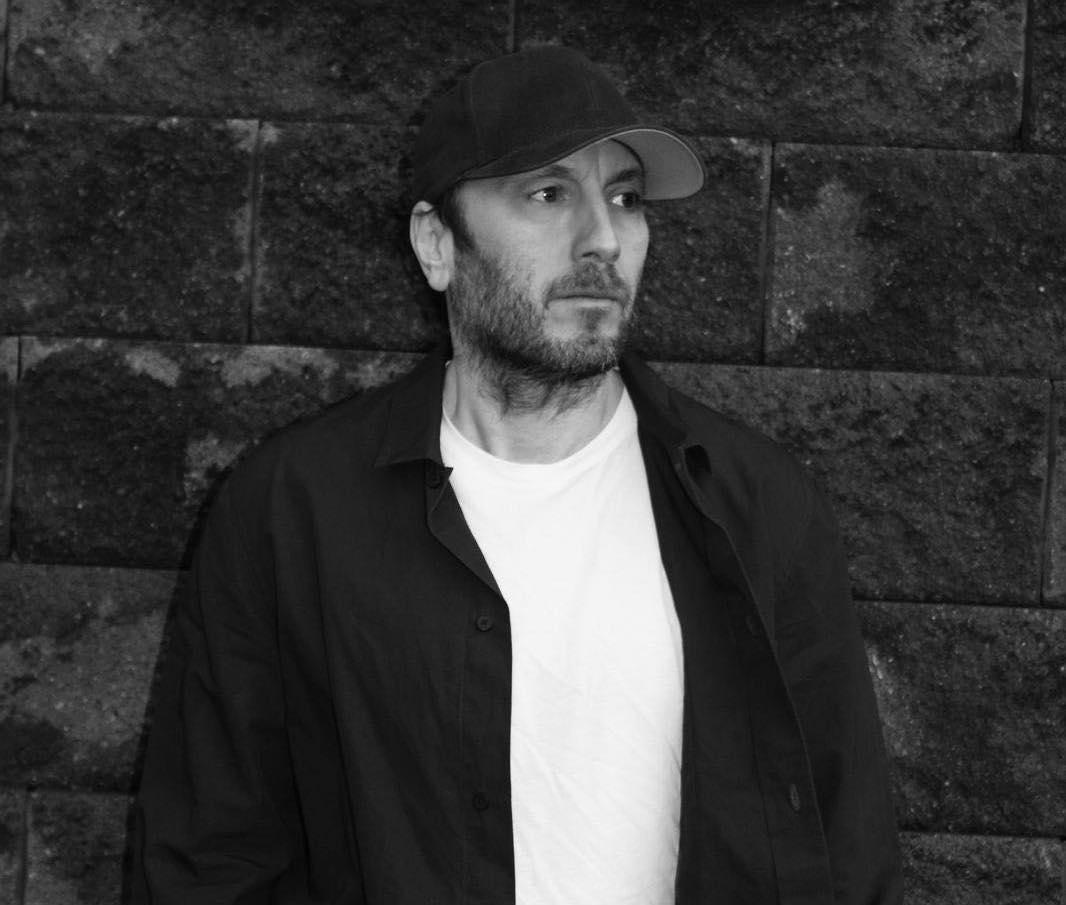
Under The Covers: Graeme Swinton
Under The Covers: Getting to know the artists who give birth to the visual identity of a release…
In this series we turn the lens on the designers, illustrators and artists behind some of our favourite record sleeves to find out how music fuels their art and where their inspirations lie. We all know how important artwork can be in telling the story of a release; it can give life to the music under the cover, it can spawn new ideas, raise questions and probe for answers. Here we explore how these two creative mediums relate, influence one another and converge to create something entirely fresh…
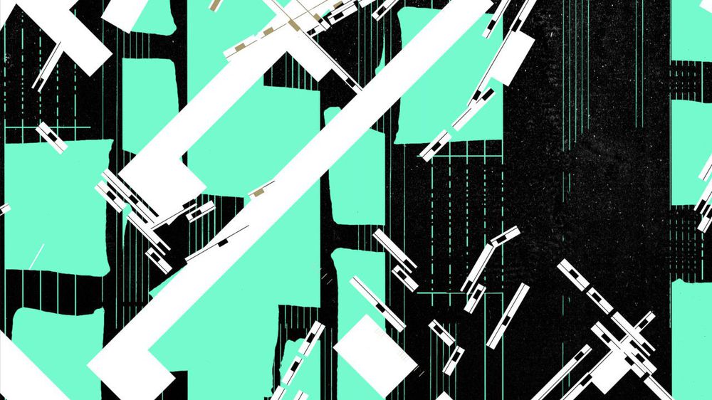
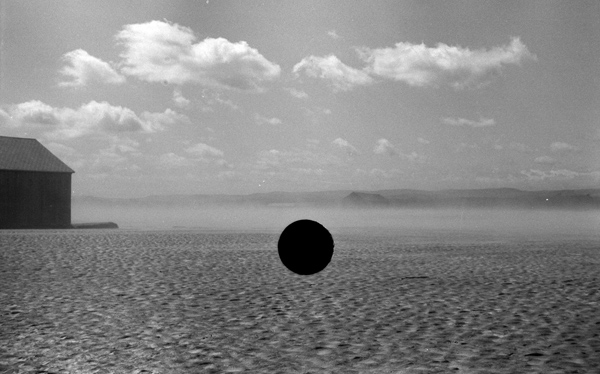
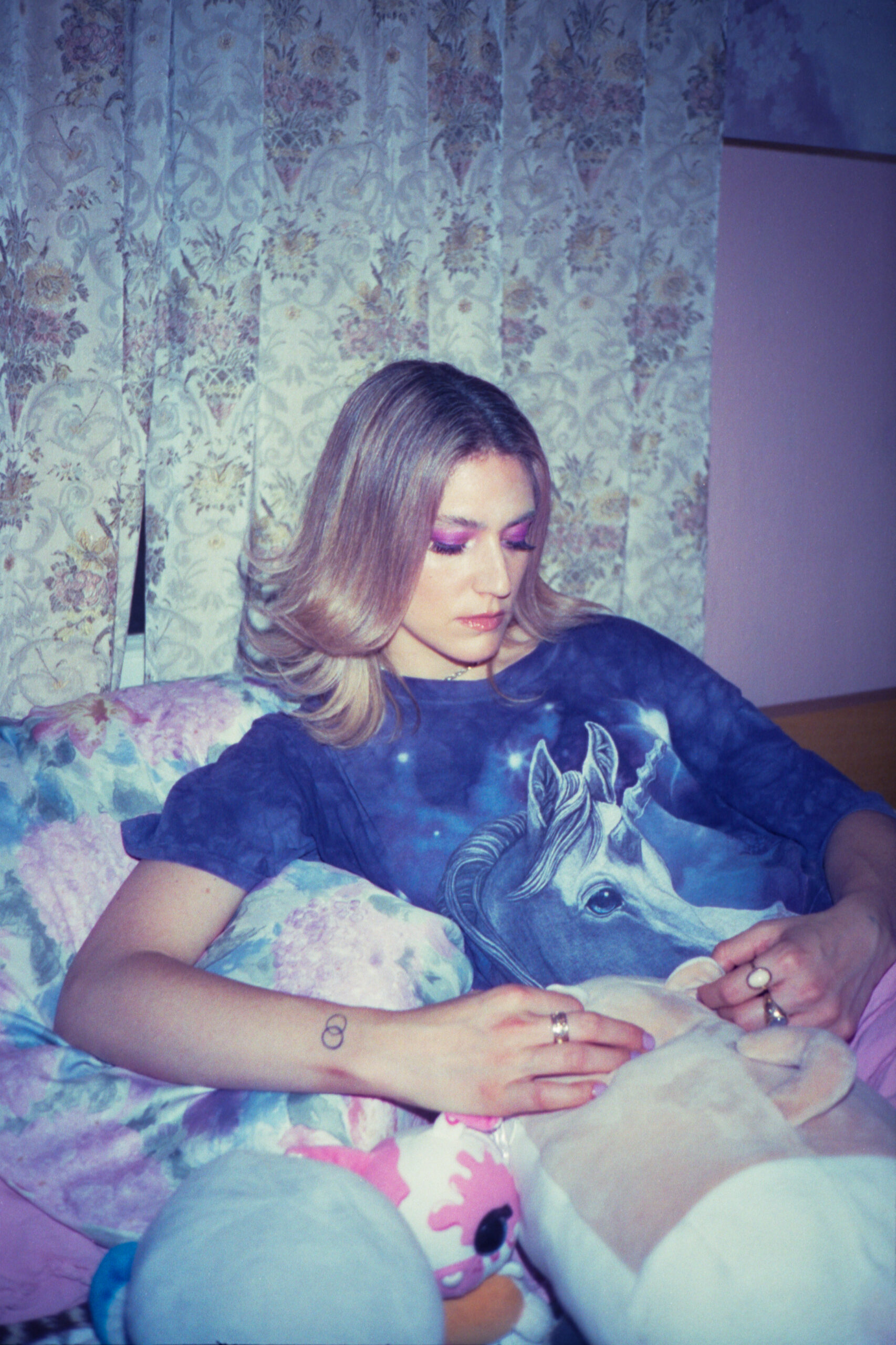
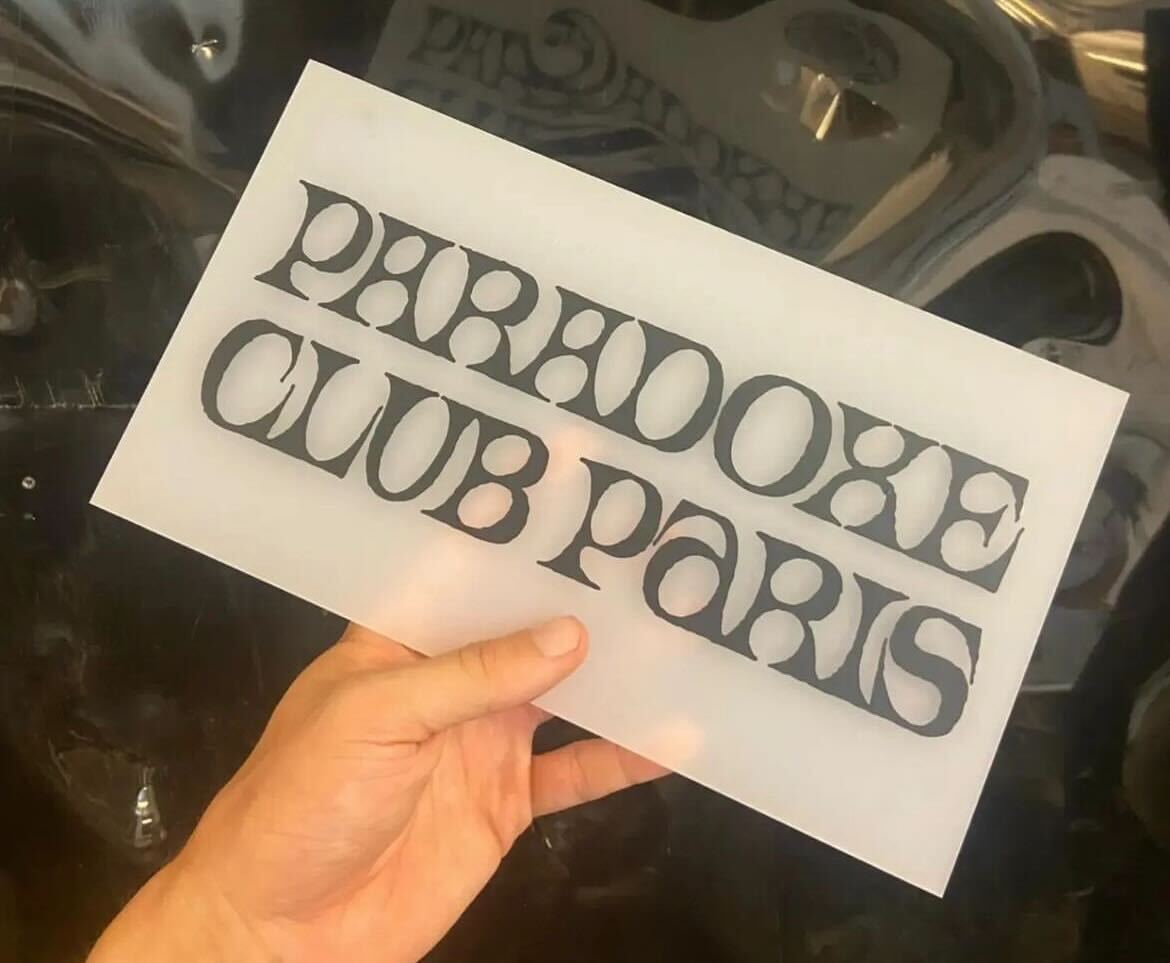
The first artist in our series is Graeme Swinton, a designer who has contributed artwork to a number of labels including several releases for Seagrave, Fort Evil Fruit, Phinery, Rough Trade and our very own Ransom Note sub-label Bytes. Working with photography, drawings, collages and type, his designs seek to compliment the music he works with, identifying specific themes and narratives, at times drawing inspiration from other artwork and projects he comes across. Music has always fed heavily into his design, but on top of his aesthetic creations Graeme also produces "kind of electronic music" himself as Palace Lido; previously contributing releases for Czaszka, Speaker Footage and Seagrave. In this interview we chat to him about his path into art and design, the projects that stuck with him and what's on the horizon…
What’s your art/design background? Has music always influenced your approach to art?
I was always drawing as a kid, all sorts of stuff and music was an important part of this, I didn’t realise it at the time but I was certainly influenced visually by what I was listening to. I loved record sleeves and music by Adam and the Ants, ABBA, Human League, Pet Shop Boys… In terms of an art education my secondary school had a great art teacher. I remember he would be quite irreverent in his approach which I thought was brilliant. Although he’d play terrible abstract jazz tapes in class which was horrible. Then I had a wonderful year on foundation course un-learning all the stuff I did at school and sadly listening to a lot more jazz. I don’t know what it is about art teachers and jazz? I’d play my Psychocandy tape when I could which for some reason they hated.
Then I went to art school just when the Internet was beginning, so I had this mix of a love of music, a love of art and this new computer thing. I had an Amiga computer which I’d make terrible work on and even worse music. I was obsessed with labels such as Rephlex, Tresor and Warp. It all felt totally new. I like it when a scene or something emerges and people have an idea but don’t really understand the potential or realise how far it can go.
I dug out my copy of ‘X-102 – Discovers The Rings Of Saturn’ by Jeff Mills last year, still sounds amazing to me. In fact, this album is still shaping how I work now 25 years later as it lead me to start this techno-black&white-riso-collage project and, in homage, I’ve called it x102eu. One of the recent pieces was used on a cassette by the ever prolific Takahiro Mukai on Cork’s ‘Fort Evil Fruit’ label. Really good electro minimalism on a label which has a knack for releasing nothing but great work.
How would you describe your approach to design?
My work is, I hope, simple and direct and clear. My approach varies depending on what’s going on at the time. Any work will eventually end up being manipulated on a computer but the starting point could be photography or type or drawing or collage, all sorts…
What are you trying to communicate?
There’s not really one answer to this… If it’s a record sleeve then it’s to be memorable or at least visually appealing and I certainly hope to compliment or sit alongside the music in some way. If it’s something I’m doing for myself then often or not that’s harder. I must admit I prefer to have a concept or a goal, a bit like the x102eu stuff, I knew what I wanted it to be as an idea but wasn’t sure exactly how it would end up.
Who or what would you consider as some of your main influences? Aesthetically and musically…
In recent years it would be the artwork of John Baldessari; the mix of text, colour and images. I saw a recent show of his at the Marian Goodman Gallery and I stayed for hours. I have a postcard of a piece of work he did which shows a man standing on a street that just says WRONG underneath it, I look at this a lot for some reason!

From a music perspective pretty much all of the Pet Shop Boys sleeves by Mark Farrow; in fact Pet Shops Boys in general, my company is called Actually after all. As a label I think a lot of what Blackest Ever Black release is great, both musically and visually – I think my favourite sleeve is the first Raime album Quarter Turns Over A Living Line. Also the Tropic of Cancer 12” which lead me to find out about Jasmine Deporta. Her photos are amazing; I’ve since bought a couple of her prints which are proudly framed in my house and her new book 11 – Eleven is great. In fact the design of the book by Studio 24-24 I really like. Simple sans serif and colour and the photographs placed without fuss.

It would be remiss of me to not mention Peter Saville’s art direction for Factory Records. The New Order sleeves are perfect. In fact the art direction Peter Saville did for Pulp’s This Is Hardcode album and singles is brilliant too. The Party Hard release especially.
:format(jpeg):mode_rgb():quality(90)/discogs-images/R-1006406-1184066575.jpeg.jpg)
More recently the artist Taryn Simon has done some beautiful work. There’s a series I really like called Paperwork and the Will of Capital where she recreates the flower arrangements from important political accords and treaties. There’s something a little bit Power, Corruption & Lies about them…
What have been your favourite project(s) to work on so far?
There’s been a couple… I did the artwork for a 12” for Shinya Sugimoto & Jeremy Young with Julia Kent called "Total Fiction" on Denmark’s Phinery label. Benjamin from the label had sent me the music which I instantly loved and I really wanted to do the music justice if you know what I mean?
I’d just been to see an Artangel exhibition called Inside at the old Reading Gaol where Oscar Wilde was held. Steve McQueen had a piece of work there called Weight which I think was a gold metal mosquito net draped over a cell bed. It was such a beautiful object in such a shockingly brutal place. I took some photos and these become the basis of the artwork on the back. The front of the sleeve was a geometric abstract thing which started out from a photo of a stack of paper on a cell floor.

Also the very recent JARV IS… sleeve was so good to work on. Jarvis showed me a record by Chris Petit called ‘In What's Missing, Is Where Love Has Gone’. The sleeve shows a close up of David Bowie from ‘The Man Who Fell To Earth’ screen-printed on the exterior outer vinyl sleeve with a simple paper inner; it has a DIY feel and is very tactile. There’s also a record designed by Central Station Design for the Happy Mondays’ Squirrel And G-Man Twenty Four Hour Party People Plastic Face Carnt Smile (White Out) album, that too is screen printed on the outer sleeve.
The JARV IS… track is sort of about a primordial rave (with occasional badger) so I wanted to do something very old school RAVE flyer-ish, something very in your face and garish even. I was sent a photo taken by the artist Andy Holden of a speaker stack at the JARV IS… gig they did in a cave at Peak Cavern, Castleton and this was the starting point.

It made sense to mess about with colour a lot and to place huge sans serif text (Suisse) over the top simply saying MUST I EVOLVE? The repeated yes yes yes no no no refrain from the record I framed the sleeve with was a nod to the Monkees Head album. Hey maybe the colours of the sleeve came from the water sequence of Porpoise Song when the Monkees jump off the bridge, never thought of that before?
I ended up doing four different colour variations of the JARV IS… sleeve, which Rough Trade pressed up in four limited editions sold at gigs.
How important do you feel that the relationship is between music and art?
Oh this is huge, I don’t think one can exist without the other. They might go their own way every now and then but they always converge.
Are there any other projects that combine music and art that you draw inspiration from?
I really like the photography of Collier Schorr, who in a roundabout link to music has photographed Jehnny Beth from the Savages a few times now I think. I saw Collier Schorr’s last show at Modern Art in London which was brilliant. It included collages and cut-outs if I remember correctly. In fact Modern Art represent another amazing artist called Paul Lee, I can say that as he’s an old and very dear friend. I couldn’t make it but the photos from his last show at Karma in New York were ace. The new work which includes his signature tambourines are so good! In fact I hear he has a new album out soon also… Oh yes and the Ragnar Kjartansson artwork The Sky In A Room which I saw in Cardiff, totally blew me away!

You designed the artwork for Ransom Note’s sublabel Bytes, can you talk us through what you wanted to translate with each release?
Overall in terms of a label identity, I felt it needed to have a thing that could be uniquely Bytes. I saw some photos that were taken in the Great Depression and was struck by how destructive they were. Basically any photo that didn't pass the grade had a hole punched in the negative making them worthless, however what they've actually done is make them all the more beautiful. So for Bytes, I was thinking about having some circular device that we can place over any artwork to obscure it a little but also to stamp it as Bytes.
Also Joe from the label wanted to only release tapes to start with and we discussed old Fleetwood Mac and Prince tapes when labels would simply place the vinyl artwork in a square on the tape cover with a panel underneath simply showing the title. I love the utilitarian nature of this. No messing about. And of course the early Warp Artificial Intelligence releases which Bytes by Black Dog holds such a special and important place.
So far we’ve had tapes by Minotaur Shock, GLOK (which is also coming out on vinyl) and there’s a new album by Franz Kirmann in the pipeline. If anyone’s interested here’s the process for how we got to the end result for the Franz tape. Each release has come from different places in terms of the design, shaped in part by the music and comments from each artist. There’s an aesthetic thread that runs through each one but they all do have their own identity which I think is important. Musically all great albums too which is a credit to Joe and Wil.

Working on musical briefs, do you disassociate from what you know about the artist and their music or do you draw inspiration from that?
Sometimes I listen to the tracks when I’m working things out, sometimes the artist will have something specific in mind or a title or track will lead me off in a certain direction, there’s really no set way of working. I’m actually trying to think of an occasion where I disassociate myself from the artist and I don’t think I do no.
What projects have you got on the horizon?
There’s the new tape on Bytes for Franz Kirmann which is coming out soon and the JARV IS… Must I Evolve? record is getting a full commercial release with an adapted sleeve featuring spot varnish on the text. From a personal angle I make ‘kind of’ electronic music under the name Palace Lido and have had releases out on Speaker Footage, Czaszka and Seagrave in the past.
I have a new tape coming out in Sep on Czaszka who incidentally have the most fantastic artists Karolina Pietrzyk & Oliver Spieker doing pretty much all of their releases. With this new album I wanted it to be something more than just a tape and digital release, it felt like it would be good to have an extension in some way outside the tape which I could feedback into the release. So I’m making a re-version of the album using audio recordings left on an answerphone from a phone number which is also the name of the album. So the album’s called 030 030 23032 and if you ring this number, leave a message I’ll then get emailed the audio recording. These recordings will be used as a basis for the re-version. This will come out later on in the year on Czaszka also.
Follow Graeme Swinton.
Topics


Must Reads
David Holmes – Humanity As An Act Of Resistance in three chapters
As a nation, the Irish have always had a profound relationship with the people of Palestine
Rotterdam – A City which Bounces Back
The Dutch city is in a state of constant revival
Going Remote.
Home swapping as a lifestyle choice
Trending track
Vels d’Èter
Glass Isle
Shop NowDreaming
Timothy Clerkin
Shop Now